Full disclosure… I’m a Cubs fan. And not one of those Johnny-come-lately, oh look the Cubs are great now fans. I’ve been a fan for 25 years, and still I’m a lightweight compared to many! But I may be biased.
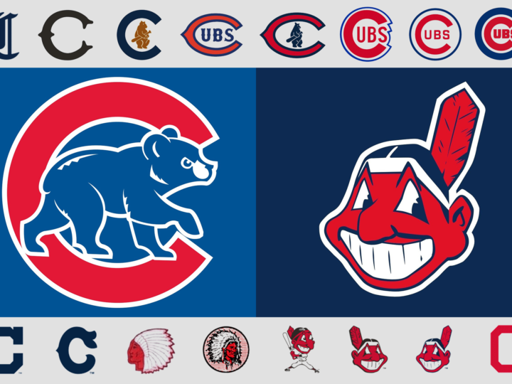
By any objective standard, if the World Series was based on the team’s logo, the Cubs wouldn’t be hoping to break a 108-year-long World Series drought by defeating the Cleveland Indians this year! Even if the Cubs didn’t have one of the best, most classic logos in all of the major leagues, the Indians are saddled with one of the worst.
Chief Wahoo came into existence in 1932 when the Cleveland Plain Dealer featured a caricature of a Native American with shaded skin and a pointy nose drawn by Fred George Reinert. And now, 84 years later, this racist caricature of a Native American remains the logo of the Cleveland Indians despite a campaign by some to get the baseball franchise to finally do away with the controversial emblem.
In stark contrast is the Chicago Cubs logo… easily one of best. It has been a continual evolution that started with the 1919 version of the logo. There are 6 different versions of the current classic logo of a “C” with “UBS” inside the “C.” The giant “C” has become rounder inside the blue circle and more geometric while the outlines are thicker. The first appearance of the bear was in the 1908 logo, which was also the last time the Cubs won the World Series. Now streamlined and stylized, the bear cub is ready to take on Chief Wahoo and the rest of the Indians in the 2016 World Series! Go Cubs, go!
