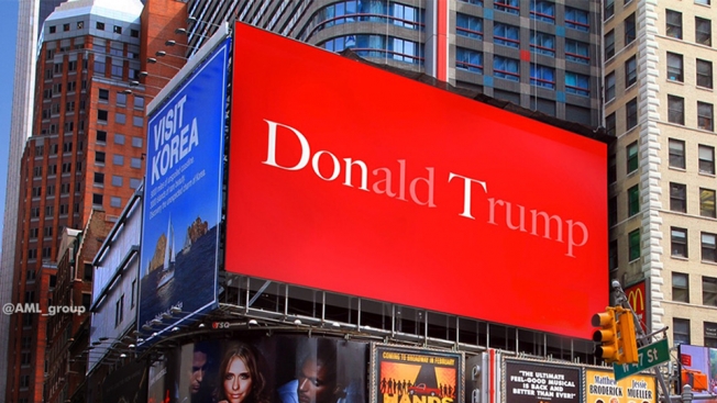
Sometimes it’s the letters you leave out that say the most in advertising. Take these two examples for instance…
While scrolling through my Facebook feed today, I saw a brilliant piece of advertising on a billboard in New York City that a friend had posted. It’s simply a red background with Donald Drumpf printed in white on it. But the letters ‘Don’ and ‘T’ stand out bright white while the rest of the letters are ghosted back. The message is unmistakably ‘Don’t Drumpf’ and conveys its message in a brief burst that is both eye-catching and memorable. According to Adweek “it comes from London agency AML, a quick and inspired Photoshop job by Stephen O’Neill for an internal creative award (which he won). And like ghost ads often do, the concept escaped: An agency staffer in Singapore got hold of it, and shared it with followers.”
On the other hand we have the cautionary tale of Ted Cruz. Before he withdrew from the race, he was running on a slogan that’s a play on ‘Trust’ and ‘Ted’ which resulted in a logo which says TrusTed. But this attempted typographic slight-of-hand may have backfired. According to the Daily Kos…
“Turns out that when you Google “TRUS”, the logo at once becomes hilarious and hilariously appropriate:
“A transrectal ultrasound (TRUS) is an ultrasound technique that is used to view a man’s prostate and surrounding tissues. The ultrasound transducer (probe) sends sound waves through the wall of the rectum into the prostate gland, which is located directly in front of the rectum.”
Yup, that’s the very top Google result. Basically, it’s an anal probe. Which makes us even more certain that he’s actually an alien.


