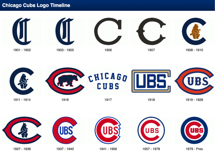
With the beginning of the 2016 baseball season, I thought I’d take a look at my favorite team logo, which coincidentally belongs to my favorite team… The Chicago Cubs. As one of the most storied teams in MLB history, it is only fitting that the evolution of their logo should be equally fascinating.
The Chicago Cubs began life in 1870 when they were known as the Chicago White Stockings, they spent one season as a traveling pro team before joining the National Association in 1871. After several different official and unofficial nicknames, and a switch to the brand new National League in 1876 the team started to be referred to as ‘the Cubs’ by local media beginning in 1902. By 1906 this was the sole name by which the club was known.
With the exception of two seasons in the early 20th century, the franchise has used blue in one way or another on their uniforms since 1901 when they were still known as the Chicago Orphans. A prominent part of every team logo has been a large C and for the better part of the past 100 years has used a variant of a large ‘C’ with ‘UBS’ written inside of it. This style made its first appearance in 1918 and subsequently evolved several times in the following decades with changes happening in 1919, 1937, 1941, 1957, and 1979.


