When I heard of His Purple Majesty’s untimely passing yesterday, I not only mourned the loss of a talented musician (who provided a big part of the soundtrack to my college years), I mourned the loss of a uniquely gifted visual artist as well. Prince’s canvass was his body, his lifestyle, his music, and his attitude. There will probably never be another artist who can match his masterful blending of textures, colors, symbols, images, genders, genres, words and music into something so flamboyantly well… Prince.

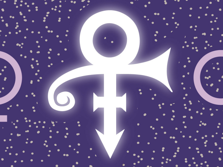
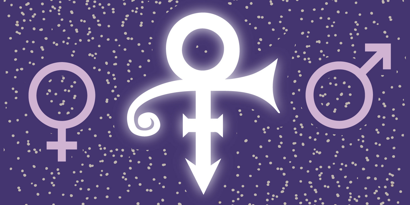
Perhaps the best example of this is Prince’s adoption in 1993 of The Love Symbol, an unpronounceable mark, as the only proper visual moniker for The Artist Formerly Known as Prince.

He stated in a press release at the time:

Warner Bros took the name [Prince], trademarked it, and used it as the main marketing tool to promote all of the music I wrote. The company owns the name Prince and all related music marketed under Prince. I became merely a pawn used to produce more money for Warner Bros…. I was born Prince, and did not want to adopt another conventional name. The only acceptable replacement for my name, and my identity, was a symbol with no pronunciation, that is a representation of me, and what my music is about. This symbol is present in my work over the years; it is a concept that has evolved from my frustration; it is who I am. It is my name.

In order to use the symbol in print media, Warner Bros. had to organize a mass mailing of floppy disks with a custom font. Yes they had to make a custom font just for Prince!

For an in-depth look at the evolution of Prince’s brilliant self-branding, check out this article in Fader:
The Higher Meaning Behind Prince’s Love Symbol


Getting out the vote is a priority in any election, but this year’s Presidential election looks to be the most important in a generation. The Supreme Court, Health Care, Education, Financial Reform, Racial Issues, Immigration and the continued existence of our planet all hang in the balance. So what can we do as visual designers to motivate people to vote? AIGA’s Get Out the Vote 2016 campaign is one way.

Starting on February 15, Presidents Day, AIGA is relaunching Get Out the Vote for 2016. This civic engagement initiative wields the power of design to motivate the American public to register and turn out to vote in the 2016 general election, as well as local elections to come.

This year, in partnership for the first time with the League of Women Voters, AIGA will Get Out the Vote by:

  • Presenting an online gallery of original, nonpartisan posters for printing and public distribution (below)
  • Organizing exhibitions in conjunction with the Republican National Convention (Cleveland, July 2016), Democratic National Convention (Philadelphia, July 2016), and AIGA Design Conference (Las Vegas, October 2016)
  • Programming local events throughout the year organized by AIGA chapters and student groupsacross the country in partnership with League of Women Voters affiliates and other local partners

Get involved

Design a poster
All AIGA members are invited to contribute posters to the 2016 collection through the online entry form. Submissions will be accepted through the general election, November 8. Download the .zip file containing the InDesign template for your poster. Designs will be reviewed by AIGA to ensure they communicate a voter-mobilizing call to action through nonpartisan visuals and copy.

Click here to submit your design now!

Share a poster
AIGA Get Out the Vote posters are available for download, printing, and distribution by anyone interested in supporting our mission. Designs are scaled at 11 x 17 inches to suit personal color printers (as well as commercial printing presses). Explore the the gallery below and help us Get Out the Vote in your community!

If sharing on social, use the hashtag #AIGAvote.

Background

AIGA has activated its community of designers across the U.S. and beyond to Get Out the Vote every four years since 2004. To see work featured in past campaigns, visit Get Out the Vote 2008 and Get Out the Vote 2012. The campaign is part of Design for Democracy, an AIGA initiative to increase civic participation through design.

Program partner

league-of-women-voters-500A respected leader in the voter engagement field for over 95 years, the League of Women Voters is active in all 50 states and nearly 800 communities. League volunteers conduct nonpartisan voter registration, education, and mobilization year-round with the goal of engaging millions of voters in local, state, and federal elections, and ensuring that they have fair and equal access to the vote. Visit the League’s award-winning election information website, VOTE411.org, to find out about upcoming elections in your community.


New York illustrator Stephen Kroninger has been on fire with his Election 2016 illustrations. There seems to be a new one every day on my Facebook feed and each one is more hilariously insightful than the one before! I’ve known Stephen since 1986, when we both worked at The Village Voice in New York City. Aside from being one of my favorite people on the planet, Stephen is also an absolutely brilliant artist who is the only illustrator to ever get a one-person show at the Museum of Modern Art.

You can see the entire series so far on Stephen’s website:

More Election 2016 – Part 4

More Election 2016 – Part 3

More Election 2016 – Part 2

Election 2016


With the beginning of the 2016 baseball season, I thought I’d take a look at my favorite team logo, which coincidentally belongs to my favorite team… The Chicago Cubs. As one of the most storied teams in MLB history, it is only fitting that the evolution of their logo should be equally fascinating.

The Chicago Cubs began life in 1870 when they were known as the Chicago White Stockings, they spent one season as a traveling pro team before joining the National Association in 1871. After several different official and unofficial nicknames, and a switch to the brand new National League in 1876 the team started to be referred to as ‘the Cubs’ by local media beginning in 1902. By 1906 this was the sole name by which the club was known.

With the exception of two seasons in the early 20th century, the franchise has used blue in one way or another on their uniforms since 1901 when they were still known as the Chicago Orphans. A prominent part of every team logo has been a large C and for the better part of the past 100 years has used a variant of a large ‘C’ with ‘UBS’ written inside of it. This style made its first appearance in 1918 and subsequently evolved several times in the following decades with changes happening in 1919, 1937, 1941, 1957, and 1979.