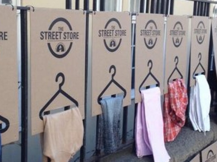
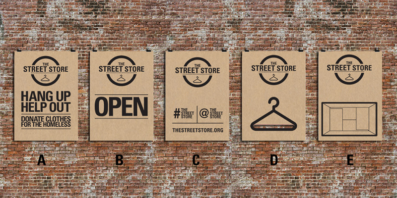
Unlike some food, design can be good for you and still be appealing and tasty. Take The Street Store, for instance. I was recently introduced to this ‘franchise’ of pop-up stores for the homeless through a friend’s Facebook post. I was duly impressed by their charitable mission, but it was their elegant, smart and utilitarian design that really wowed me. The use of simple, bold graphics on cardboard is both understated and powerful at the same time. It is helpful, and enticing without being overbearing or preachy. Images of all kinds of needy people weeping for joy as they find the perfect fit in a pair of shoes reinforce the message that this is about helping people.

Anyone interested in hosting a Street Store event can apply through their website thestreetstore.org and follow seven simple steps to change the life of the needy for the better. Included are five posters with instructions on how to use them:
The-Street-Store-Posters

My personal favorite is the poster which functions as a hanger for clothes, but all have the same simplicity and powerful impact.


“Tonight we cry. Tomorrow we fight!”

That was my final tweet before calling it quits on the worst Election night of my life. I thought nothing could top the 2000 Election which dragged on for weeks before George W. Bush was declared the winner by a margin of 537 votes in Florida. But Drumpf’s victory Tuesday night wasn’t just about political differences. That I could handle. Drumpf’s victory represents a personal violation of everything I hold most dear: freedom, justice and equality for all; a woman’s right to self-determination; compassion and aid for the most vulnerable among us; a celebration of diversity; the pursuit of peace; and, perhaps most importantly, a commitment to preserve the earth for all living things.

So what now?

In the immediate aftermath, CNN commentator Van Jones said “This was many things. I — this was a rebellion against the elites, true. It was a complete reinvention of politics and polls. It’s true. But it was also something else. We’ve talked about race –we’ve talked about everything but race tonight. … This was a whitelash. This was a whitelash against a changing country. It was a whitelash against a black president, in part. And that’s the part where the pain comes. And Donald Drumpf has a responsibility tonight to come out and reassure people that he is going to be the president of all the people who he insulted and offended and brushed aside. Yeah, when you say you want to take your country back, you’ve got a lot of people who feel that we’re not represented well either, but we don’t want to feel that someone has been elected by throwing away some of us to appeal more deeply to others. So, we — this is a deeply painful moment tonight. I know it’s not just about race. There’s more going on than that, but race is here too. We’ve got to talk about it.”

Representative John Lewis said “We cannot be complacent, but we cannot be vengeful. We must speak truth to power and fiercely defend those who are the most vulnerable.”

Senator Elizabeth Warren said “We will stand up to bigotry. No compromises ever on this one. Bigotry in all its forms. We will fight back against attacks on Latinos, on African Americans, on women’s, on Muslims, on immigrants, on disabled Americans, on anyone.”

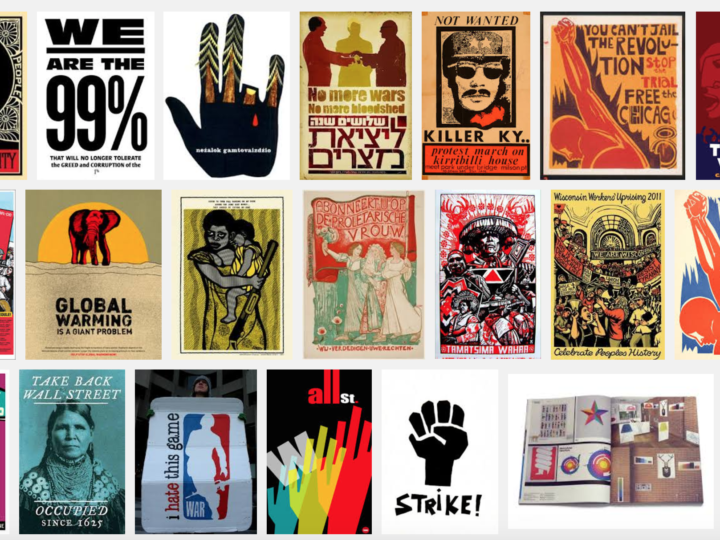
Today, I am trying to find a way forward, in part by looking back at the long history of protest graphics. Guity Novin’s online textbook A History of Graphic Design includes a chapter on protest graphics. From the Vietnam war through Occupy Wall Street and the Arab Spring, the chapter includes a wealth of inspiration for the future.

So if you, like me, are mourning the results of the Election, take heart! Throughout history the arts community has led the charge against hatred and bigotry. Together, WE SHALL OVERCOME!!


When I heard of His Purple Majesty’s untimely passing yesterday, I not only mourned the loss of a talented musician (who provided a big part of the soundtrack to my college years), I mourned the loss of a uniquely gifted visual artist as well. Prince’s canvass was his body, his lifestyle, his music, and his attitude. There will probably never be another artist who can match his masterful blending of textures, colors, symbols, images, genders, genres, words and music into something so flamboyantly well… Prince.

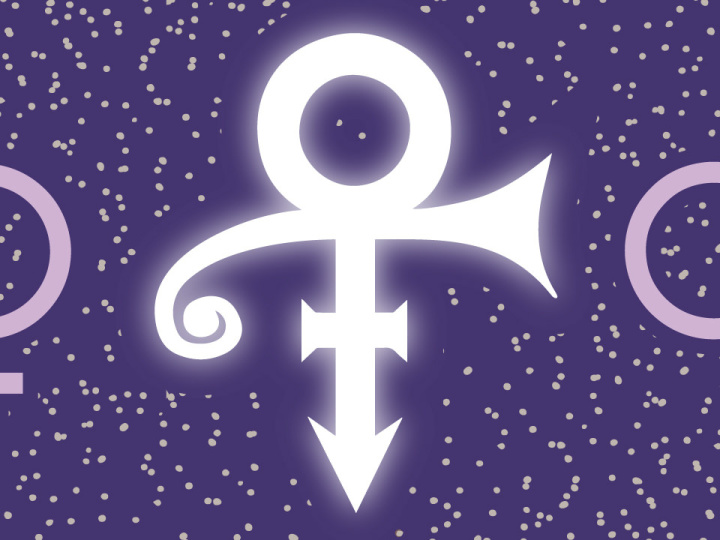
Perhaps the best example of this is Prince’s adoption in 1993 of The Love Symbol, an unpronounceable mark, as the only proper visual moniker for The Artist Formerly Known as Prince.

He stated in a press release at the time:

Warner Bros took the name [Prince], trademarked it, and used it as the main marketing tool to promote all of the music I wrote. The company owns the name Prince and all related music marketed under Prince. I became merely a pawn used to produce more money for Warner Bros…. I was born Prince, and did not want to adopt another conventional name. The only acceptable replacement for my name, and my identity, was a symbol with no pronunciation, that is a representation of me, and what my music is about. This symbol is present in my work over the years; it is a concept that has evolved from my frustration; it is who I am. It is my name.

In order to use the symbol in print media, Warner Bros. had to organize a mass mailing of floppy disks with a custom font. Yes they had to make a custom font just for Prince!

For an in-depth look at the evolution of Prince’s brilliant self-branding, check out this article in Fader:
The Higher Meaning Behind Prince’s Love Symbol


I spend so much time thinking about attracting people to the things I design that I was taken aback by the concept of ‘hostile design’ when I first heard about it. Call me a zany optimist, but I always thought of public parks as pleasant places and bus benches as making modern life more convenient. Now I find out people actually design things in public spaces to DISCOURAGE the public from using them for too long or too comfortably.

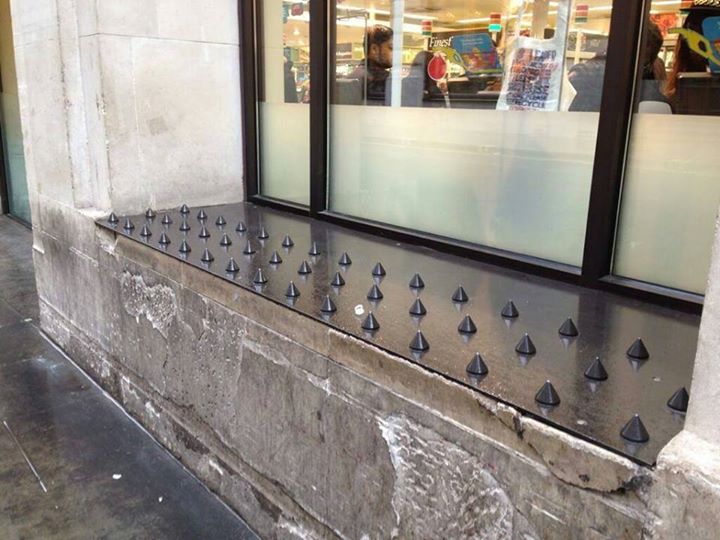
In this 99% Invisible episodeGordan Savičić and Selena Savić, co-editors of the book Unpleasant Design, point out the use of everything from sounds and lights (my favorite being housing estates in the UK that put up pink lighting, aimed to highlight teenage blemishes), to more overt physical measure such as metal spikes on benches, to keep the undesirables away. The problem with this approach is that it addresses the symptoms of the problem (like homeless people sleeping on bus benches) rather than the deeper causes of the problem. Unpleasant designs for public spaces are essentially shuffling people off to bother somebody else.

The other problem with hostile design is that metal spikes can’t make a judgement call when somebody needs help. According to 99% Invisible: “The reason we need a critical theory of unpleasant design is so we can recognize the coercion that is taking place in our public spaces. We need to know when we are replacing human interaction, nuance and empathy with hard, physical and non-negotiable solutions.”

For my part, I think we have enough hostility in our public environment already. What we need is a welcoming, inclusive public architecture, not a bench that gives us the brush off!


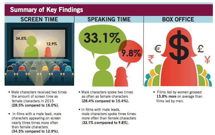
How do you quantify a deficiency that approximately half of the audience is blind to? That’s the question that led Geena Davis, Academy Award Winning Actress and Founder of the Geena Davis Institute on Gender in Media, to become a data head. According to this interview on KPCC’s Take Two, Davis was inspired by the lack of strong female role models for her young daughter, to find a way to hold Hollywood’s feet to the fire when it comes to gender equality in entertainment.

Together with Shri Narayanan, of USC’s Viterbi school of engineering and technical research lead and Julie Ann Crommett, Google’s Entertainment industry educator in chief, the Institute recently unveiled their new software at the Global Symposium on Gender in Media. It’s called GD-IQ, short for Geena Davis Inclusion Quotient, and it measures things like screen time and speaking lines for various characters.

Shri Narayanan explains how it works… “For example just take the visuals, so shot by shot this computer algorithm goes through it and figures out, where are the faces? Once that’s done, it tracks them through the scenes and then automatically another algorithm figures out what is their gender and then you can run through the data in real time…and so by the end of that you have specific numbers and in a quick way have how much screen time a person has and how it’s distributed across various genders.”

The software then produces a score, indicating the level of gender diversity for the program or film. Viewers and advertisers can judge whether or not they want to associate themselves or their products with the show based on that score.

Given that we may soon have our first woman President, and not just on a TV show, I think this is well-timed indeed!


If you’re like me, you don’t have time to give every seller or service feedback when they request it. In fact, when I see “How did we do…” in the subject line of an email I automatically delete it. So I sympathize with the plight of online retailers and services who desperately want positive feedback to post on their site.

But I was still a little surprised to receive an email request for feedback from Expedia that consisted of nothing more than a smiley face and a frowny face, with the question “Happy with your United trip?” My immediate response came straight from my husband as I thought “Well who can say they’re truly happy?” The next thing that occurred to me was, what if I’m just feeling so-so about my trip? Can I click between the faces to indicate that? I have access to dozens of emoticons every time I post on Facebook. I could write Haiku in emoticons if I wanted! Have things come to such a pass that consumers are limited to happy and sad for feedback?

Admittedly, I’m only moved to leave feedback for something because it was sublime, or terrible. But still it seems demeaning to be forced into such a limited choice. Maybe I’ll go to Expedia’s website and leave them feedback about their feedback request…


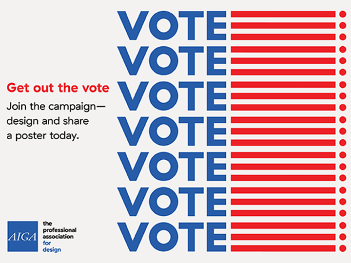
Getting out the vote is a priority in any election, but this year’s Presidential election looks to be the most important in a generation. The Supreme Court, Health Care, Education, Financial Reform, Racial Issues, Immigration and the continued existence of our planet all hang in the balance. So what can we do as visual designers to motivate people to vote? AIGA’s Get Out the Vote 2016 campaign is one way.

Starting on February 15, Presidents Day, AIGA is relaunching Get Out the Vote for 2016. This civic engagement initiative wields the power of design to motivate the American public to register and turn out to vote in the 2016 general election, as well as local elections to come.

This year, in partnership for the first time with the League of Women Voters, AIGA will Get Out the Vote by:

  • Presenting an online gallery of original, nonpartisan posters for printing and public distribution (below)
  • Organizing exhibitions in conjunction with the Republican National Convention (Cleveland, July 2016), Democratic National Convention (Philadelphia, July 2016), and AIGA Design Conference (Las Vegas, October 2016)
  • Programming local events throughout the year organized by AIGA chapters and student groupsacross the country in partnership with League of Women Voters affiliates and other local partners

Get involved

Design a poster
All AIGA members are invited to contribute posters to the 2016 collection through the online entry form. Submissions will be accepted through the general election, November 8. Download the .zip file containing the InDesign template for your poster. Designs will be reviewed by AIGA to ensure they communicate a voter-mobilizing call to action through nonpartisan visuals and copy.

Click here to submit your design now!

Share a poster
AIGA Get Out the Vote posters are available for download, printing, and distribution by anyone interested in supporting our mission. Designs are scaled at 11 x 17 inches to suit personal color printers (as well as commercial printing presses). Explore the the gallery below and help us Get Out the Vote in your community!

If sharing on social, use the hashtag #AIGAvote.

Background

AIGA has activated its community of designers across the U.S. and beyond to Get Out the Vote every four years since 2004. To see work featured in past campaigns, visit Get Out the Vote 2008 and Get Out the Vote 2012. The campaign is part of Design for Democracy, an AIGA initiative to increase civic participation through design.

Program partner

league-of-women-voters-500A respected leader in the voter engagement field for over 95 years, the League of Women Voters is active in all 50 states and nearly 800 communities. League volunteers conduct nonpartisan voter registration, education, and mobilization year-round with the goal of engaging millions of voters in local, state, and federal elections, and ensuring that they have fair and equal access to the vote. Visit the League’s award-winning election information website, VOTE411.org, to find out about upcoming elections in your community.

Sometimes it’s the letters you leave out that say the most in advertising. Take these two examples for instance…

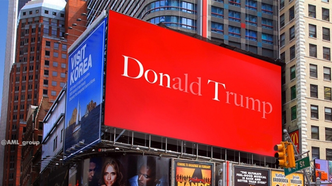
While scrolling through my Facebook feed today, I saw a brilliant piece of advertising on a billboard in New York City that a friend had posted. It’s simply a red background with Donald Drumpf printed in white on it. But the letters ‘Don’ and ‘T’ stand out bright white while the rest of the letters are ghosted back. The message is unmistakably ‘Don’t Drumpf’ and conveys its message in a brief burst that is both eye-catching and memorable. According to Adweek “it comes from London agency AML, a quick and inspired Photoshop job by Stephen O’Neill for an internal creative award (which he won). And like ghost ads often do, the concept escaped: An agency staffer in Singapore got hold of it, and shared it with followers.”

TrusTed2016

On the other hand we have the cautionary tale of Ted Cruz. Before he withdrew from the race, he was running on a slogan that’s a play on ‘Trust’ and ‘Ted’ which resulted in a logo which says TrusTed. But this attempted typographic slight-of-hand may have backfired. According to the Daily Kos

“Turns out that when you Google “TRUS”, the logo at once becomes hilarious and hilariously appropriate:

“A transrectal ultrasound (TRUS) is an ultrasound technique that is used to view a man’s prostate and surrounding tissues. The ultrasound transducer (probe) sends sound waves through the wall of the rectum into the prostate gland, which is located directly in front of the rectum.”

Yup, that’s the very top Google result. Basically, it’s an anal probe. Which makes us even more certain that he’s actually an alien.


By CHRIS CALABRESE

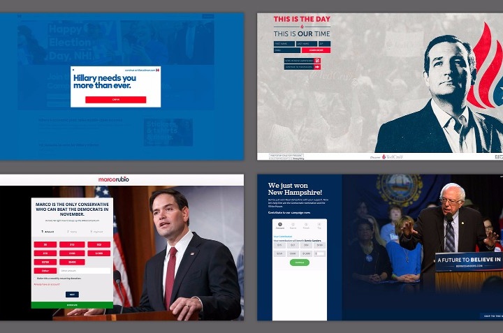
We can argue until we’re blue in the face over which presidential candidates have the best plans for health care, the economy, foreign policy, and more. One thing that is not up for debate: the quality of the candidates’ websites. Here, I’ll compare the designs of the official campaign home pages for the five leading candidates: Hillary Clinton, Ted Cruz, Marco Rubio, Bernie Sanders, andDonald Drumpf.

See full article…


Full disclosure… I’m a Cubs fan. And not one of those Johnny-come-lately, oh look the Cubs are great now fans. I’ve been a fan for 25 years, and still I’m a lightweight compared to many! But I may be biased.

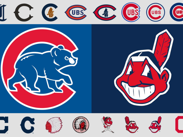
By any objective standard, if the World Series was based on the team’s logo, the Cubs wouldn’t be hoping to break a 108-year-long World Series drought by defeating the Cleveland Indians this year! Even if the Cubs didn’t have one of the best, most classic logos in all of the major leagues, the Indians are saddled with one of the worst.

Chief Wahoo came into existence in 1932 when the Cleveland Plain Dealer featured a caricature of a Native American with shaded skin and a pointy nose drawn by Fred George Reinert. And now, 84 years later, this racist caricature of a Native American remains the logo of the Cleveland Indians despite a campaign by some to get the baseball franchise to finally do away with the controversial emblem.

In stark contrast is the Chicago Cubs logo… easily one of best. It has been a continual evolution that started with the 1919 version of the logo. There are 6 different versions of the current classic logo of a “C” with “UBS” inside the “C.” The giant “C” has become rounder inside the blue circle and more geometric while the outlines are thicker. The first appearance of the bear was in the 1908 logo, which was also the last time the Cubs won the World Series. Now streamlined and stylized, the bear cub is ready to take on Chief Wahoo and the rest of the Indians in the 2016 World Series! Go Cubs, go!