We all know the story of Smokey Bear, the little orphan cub who was rescued by firefighters after barely surviving a terrible forest fire. Since 1944, the Smokey Bear Wildfire Prevention campaign has been the longest-running public service advertising campaign in U.S. history. Smokey’s face and catchphrase “Remember… Only YOU Can Prevent Forest Fires” have become the iconic image for wildfire prevention in the U.S.Smokey-4

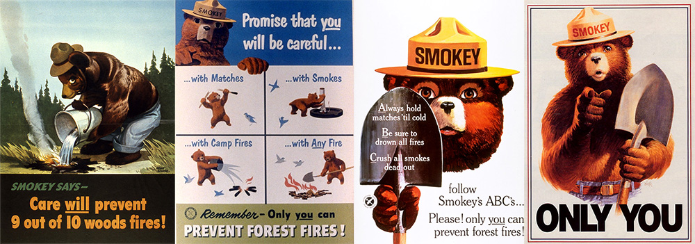
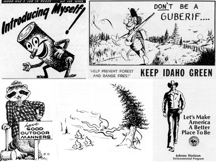
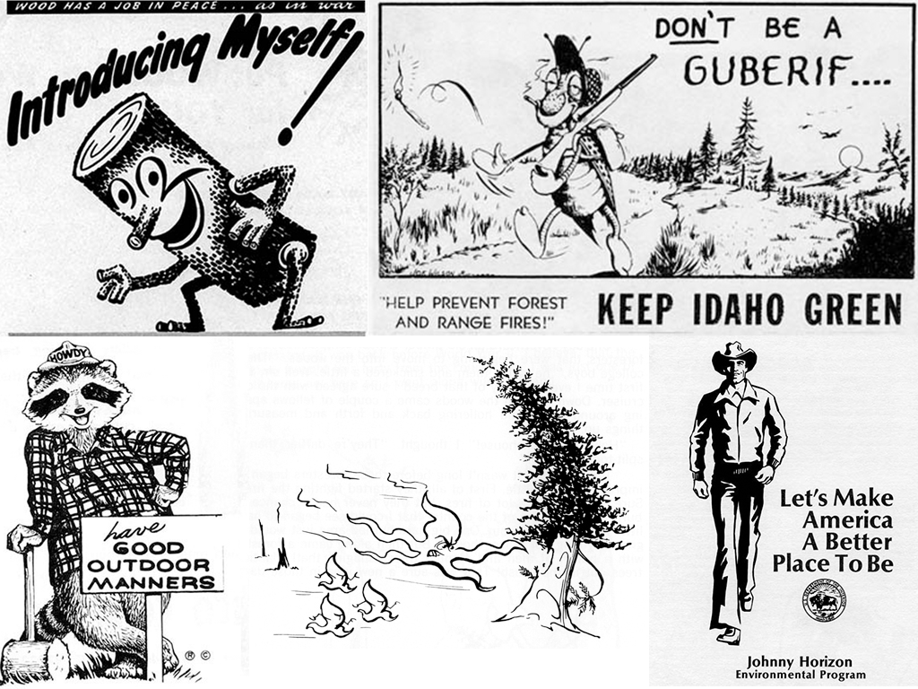
But how many people are aware of the pre-Smokey fire prevention characters? In this Atlas Obscura column, Smokey the Bear Has Nothing on These Forgotten Forest Mascots, Cara Giaimo introduces us to a wacky assortment of “spokesflora and fauna”…

  1. Woody the Log – who better to advocate for fire prevention than “a smiling, animated log”?
  2. The Guberif – firebug spelled backwards is a deadbeat, smoking insect with delusions of harmlessness!
  3. Howdy the Good Outdoor Manners Raccoon – urging children everywhere to “feed birds, protect flowers, and stop fishing in their neighbors’ streams without permission.”
  4. Johnny Horizon – environmental Marlboro Man and variety show performer.
  5. Sam Sprucetree – anti-fire and pro-logging environmentalists don’t grow on trees!
  6. Spunky Squirrel – Not your average squirrel, this one is a cool, hip-hop, fire thumping force of nature!

From 1944 through the mid ’80s, these alternate mascots battled with Smokey for supremacy over the forest fire prevention message. In the end though, Smokey smoked them all. And really, who among us is surprised? A mascot based on a cute little abandoned cub, singed but not broken, living out his life in the public view at the National Zoo? The others never had a chance.


New York illustrator Stephen Kroninger has been on fire with his Election 2016 illustrations. There seems to be a new one every day on my Facebook feed and each one is more hilariously insightful than the one before! I’ve known Stephen since 1986, when we both worked at The Village Voice in New York City. Aside from being one of my favorite people on the planet, Stephen is also an absolutely brilliant artist who is the only illustrator to ever get a one-person show at the Museum of Modern Art.

You can see the entire series so far on Stephen’s website:

More Election 2016 – Part 4

More Election 2016 – Part 3

More Election 2016 – Part 2

Election 2016


With the beginning of the 2016 baseball season, I thought I’d take a look at my favorite team logo, which coincidentally belongs to my favorite team… The Chicago Cubs. As one of the most storied teams in MLB history, it is only fitting that the evolution of their logo should be equally fascinating.

The Chicago Cubs began life in 1870 when they were known as the Chicago White Stockings, they spent one season as a traveling pro team before joining the National Association in 1871. After several different official and unofficial nicknames, and a switch to the brand new National League in 1876 the team started to be referred to as ‘the Cubs’ by local media beginning in 1902. By 1906 this was the sole name by which the club was known.

With the exception of two seasons in the early 20th century, the franchise has used blue in one way or another on their uniforms since 1901 when they were still known as the Chicago Orphans. A prominent part of every team logo has been a large C and for the better part of the past 100 years has used a variant of a large ‘C’ with ‘UBS’ written inside of it. This style made its first appearance in 1918 and subsequently evolved several times in the following decades with changes happening in 1919, 1937, 1941, 1957, and 1979.


Check out this review that calls it a “bus crash”…

www.vulture.com