If you’re like me, you don’t have time to give every seller or service feedback when they request it. In fact, when I see “How did we do…” in the subject line of an email I automatically delete it. So I sympathize with the plight of online retailers and services who desperately want positive feedback to post on their site.

But I was still a little surprised to receive an email request for feedback from Expedia that consisted of nothing more than a smiley face and a frowny face, with the question “Happy with your United trip?” My immediate response came straight from my husband as I thought “Well who can say they’re truly happy?” The next thing that occurred to me was, what if I’m just feeling so-so about my trip? Can I click between the faces to indicate that? I have access to dozens of emoticons every time I post on Facebook. I could write Haiku in emoticons if I wanted! Have things come to such a pass that consumers are limited to happy and sad for feedback?

Admittedly, I’m only moved to leave feedback for something because it was sublime, or terrible. But still it seems demeaning to be forced into such a limited choice. Maybe I’ll go to Expedia’s website and leave them feedback about their feedback request…


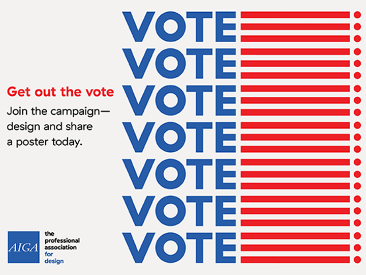
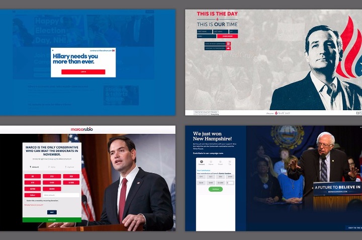
Getting out the vote is a priority in any election, but this year’s Presidential election looks to be the most important in a generation. The Supreme Court, Health Care, Education, Financial Reform, Racial Issues, Immigration and the continued existence of our planet all hang in the balance. So what can we do as visual designers to motivate people to vote? AIGA’s Get Out the Vote 2016 campaign is one way.

Starting on February 15, Presidents Day, AIGA is relaunching Get Out the Vote for 2016. This civic engagement initiative wields the power of design to motivate the American public to register and turn out to vote in the 2016 general election, as well as local elections to come.

This year, in partnership for the first time with the League of Women Voters, AIGA will Get Out the Vote by:

  • Presenting an online gallery of original, nonpartisan posters for printing and public distribution (below)
  • Organizing exhibitions in conjunction with the Republican National Convention (Cleveland, July 2016), Democratic National Convention (Philadelphia, July 2016), and AIGA Design Conference (Las Vegas, October 2016)
  • Programming local events throughout the year organized by AIGA chapters and student groupsacross the country in partnership with League of Women Voters affiliates and other local partners

Get involved

Design a poster
All AIGA members are invited to contribute posters to the 2016 collection through the online entry form. Submissions will be accepted through the general election, November 8. Download the .zip file containing the InDesign template for your poster. Designs will be reviewed by AIGA to ensure they communicate a voter-mobilizing call to action through nonpartisan visuals and copy.

Click here to submit your design now!

Share a poster
AIGA Get Out the Vote posters are available for download, printing, and distribution by anyone interested in supporting our mission. Designs are scaled at 11 x 17 inches to suit personal color printers (as well as commercial printing presses). Explore the the gallery below and help us Get Out the Vote in your community!

If sharing on social, use the hashtag #AIGAvote.

Background

AIGA has activated its community of designers across the U.S. and beyond to Get Out the Vote every four years since 2004. To see work featured in past campaigns, visit Get Out the Vote 2008 and Get Out the Vote 2012. The campaign is part of Design for Democracy, an AIGA initiative to increase civic participation through design.

Program partner

league-of-women-voters-500A respected leader in the voter engagement field for over 95 years, the League of Women Voters is active in all 50 states and nearly 800 communities. League volunteers conduct nonpartisan voter registration, education, and mobilization year-round with the goal of engaging millions of voters in local, state, and federal elections, and ensuring that they have fair and equal access to the vote. Visit the League’s award-winning election information website, VOTE411.org, to find out about upcoming elections in your community.


Sometimes it’s the letters you leave out that say the most in advertising. Take these two examples for instance…

While scrolling through my Facebook feed today, I saw a brilliant piece of advertising on a billboard in New York City that a friend had posted. It’s simply a red background with Donald Drumpf printed in white on it. But the letters ‘Don’ and ‘T’ stand out bright white while the rest of the letters are ghosted back. The message is unmistakably ‘Don’t Drumpf’ and conveys its message in a brief burst that is both eye-catching and memorable. According to Adweek “it comes from London agency AML, a quick and inspired Photoshop job by Stephen O’Neill for an internal creative award (which he won). And like ghost ads often do, the concept escaped: An agency staffer in Singapore got hold of it, and shared it with followers.”

TrusTed2016

On the other hand we have the cautionary tale of Ted Cruz. Before he withdrew from the race, he was running on a slogan that’s a play on ‘Trust’ and ‘Ted’ which resulted in a logo which says TrusTed. But this attempted typographic slight-of-hand may have backfired. According to the Daily Kos

“Turns out that when you Google “TRUS”, the logo at once becomes hilarious and hilariously appropriate:

“A transrectal ultrasound (TRUS) is an ultrasound technique that is used to view a man’s prostate and surrounding tissues. The ultrasound transducer (probe) sends sound waves through the wall of the rectum into the prostate gland, which is located directly in front of the rectum.”

Yup, that’s the very top Google result. Basically, it’s an anal probe. Which makes us even more certain that he’s actually an alien.


By CHRIS CALABRESE

We can argue until we’re blue in the face over which presidential candidates have the best plans for health care, the economy, foreign policy, and more. One thing that is not up for debate: the quality of the candidates’ websites. Here, I’ll compare the designs of the official campaign home pages for the five leading candidates: Hillary Clinton, Ted Cruz, Marco Rubio, Bernie Sanders, andDonald Drumpf.

See full article…


Yesterday in The Daily Heller, Steven Heller asked (facetiously one hopes!) Why shouldn’t electronics enable the manufacturing of “the diabolical ray”? I have to say with current events that doesn’t sound as unlikely as it would have 6 months ago! Entertaining though the 1924 illustrations are, I find it all too easy to imagine our current President chuckling evilly with his finger poised over the cartoonish ‘hate ray’ button. Blasting things out of the sky for no reason seems like it would perfectly suit his juvenile mentality. So hopefully, this one will stay in the realm of science fiction!


Full disclosure… I’m a Cubs fan. And not one of those Johnny-come-lately, oh look the Cubs are great now fans. I’ve been a fan for 25 years, and still I’m a lightweight compared to many! But I may be biased.

By any objective standard, if the World Series was based on the team’s logo, the Cubs wouldn’t be hoping to break a 108-year-long World Series drought by defeating the Cleveland Indians this year! Even if the Cubs didn’t have one of the best, most classic logos in all of the major leagues, the Indians are saddled with one of the worst.

Chief Wahoo came into existence in 1932 when the Cleveland Plain Dealer featured a caricature of a Native American with shaded skin and a pointy nose drawn by Fred George Reinert. And now, 84 years later, this racist caricature of a Native American remains the logo of the Cleveland Indians despite a campaign by some to get the baseball franchise to finally do away with the controversial emblem.

In stark contrast is the Chicago Cubs logo… easily one of best. It has been a continual evolution that started with the 1919 version of the logo. There are 6 different versions of the current classic logo of a “C” with “UBS” inside the “C.” The giant “C” has become rounder inside the blue circle and more geometric while the outlines are thicker. The first appearance of the bear was in the 1908 logo, which was also the last time the Cubs won the World Series. Now streamlined and stylized, the bear cub is ready to take on Chief Wahoo and the rest of the Indians in the 2016 World Series! Go Cubs, go!


We all know the story of Smokey Bear, the little orphan cub who was rescued by firefighters after barely surviving a terrible forest fire. Since 1944, the Smokey Bear Wildfire Prevention campaign has been the longest-running public service advertising campaign in U.S. history. Smokey’s face and catchphrase “Remember… Only YOU Can Prevent Forest Fires” have become the iconic image for wildfire prevention in the U.S.Smokey-4

But how many people are aware of the pre-Smokey fire prevention characters? In this Atlas Obscura column, Smokey the Bear Has Nothing on These Forgotten Forest Mascots, Cara Giaimo introduces us to a wacky assortment of “spokesflora and fauna”…

  1. Woody the Log – who better to advocate for fire prevention than “a smiling, animated log”?
  2. The Guberif – firebug spelled backwards is a deadbeat, smoking insect with delusions of harmlessness!
  3. Howdy the Good Outdoor Manners Raccoon – urging children everywhere to “feed birds, protect flowers, and stop fishing in their neighbors’ streams without permission.”
  4. Johnny Horizon – environmental Marlboro Man and variety show performer.
  5. Sam Sprucetree – anti-fire and pro-logging environmentalists don’t grow on trees!
  6. Spunky Squirrel – Not your average squirrel, this one is a cool, hip-hop, fire thumping force of nature!

From 1944 through the mid ’80s, these alternate mascots battled with Smokey for supremacy over the forest fire prevention message. In the end though, Smokey smoked them all. And really, who among us is surprised? A mascot based on a cute little abandoned cub, singed but not broken, living out his life in the public view at the National Zoo? The others never had a chance.


I was very sad to hear about the untimely death of actor Bill Paxton today. Not only has he been in several blockbusters over the course of his career, he’s portrayed interesting characters in literally dozens of films and TV shows. And, as my husband just pointed out, he’s been in practically no duds. For a prolific character actor, that’s very unusual.

In my own career, I’ve crossed paths with Bill Paxton on a few projects. Most recently, I worked on the poster for a movie he starred in with Laurence Fishburne, called The Colony, a futuristic, sci-fi/horror film. As is often the case with entertainment projects, we were working on the poster design concurrently with the film’s production. Principal photography had been completed, but none of the special effects had been finished yet. In order to make the film appear big and epic, (because no matter how small, studios always want their films to seem big and epic), we had to rely on a lot of artifice and stock photography to provide the proper atmosphere.

The results, I thought, were fairly successful. Two of my comps are posted above. But by the time we finished the project, the special effects were available and so the final poster is a half-and-half combination of my designs and another Art Director’s. This is also often the case with movie advertising. There are very few posters out there that can trace their origin to one artist.

And so, this is my tribute to Bill Paxton. He may have physically departed, but his presence, talent and characters will live on in both AV and print.


New York illustrator Stephen Kroninger has been on fire with his Election 2016 illustrations. There seems to be a new one every day on my Facebook feed and each one is more hilariously insightful than the one before! I’ve known Stephen since 1986, when we both worked at The Village Voice in New York City. Aside from being one of my favorite people on the planet, Stephen is also an absolutely brilliant artist who is the only illustrator to ever get a one-person show at the Museum of Modern Art.

You can see the entire series so far on Stephen’s website:

More Election 2016 – Part 4

More Election 2016 – Part 3

More Election 2016 – Part 2

Election 2016


With the beginning of the 2016 baseball season, I thought I’d take a look at my favorite team logo, which coincidentally belongs to my favorite team… The Chicago Cubs. As one of the most storied teams in MLB history, it is only fitting that the evolution of their logo should be equally fascinating.

The Chicago Cubs began life in 1870 when they were known as the Chicago White Stockings, they spent one season as a traveling pro team before joining the National Association in 1871. After several different official and unofficial nicknames, and a switch to the brand new National League in 1876 the team started to be referred to as ‘the Cubs’ by local media beginning in 1902. By 1906 this was the sole name by which the club was known.

With the exception of two seasons in the early 20th century, the franchise has used blue in one way or another on their uniforms since 1901 when they were still known as the Chicago Orphans. A prominent part of every team logo has been a large C and for the better part of the past 100 years has used a variant of a large ‘C’ with ‘UBS’ written inside of it. This style made its first appearance in 1918 and subsequently evolved several times in the following decades with changes happening in 1919, 1937, 1941, 1957, and 1979.