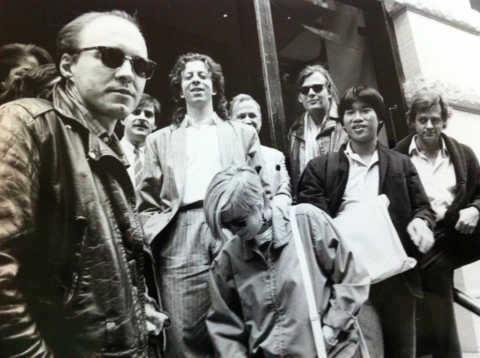
On September 9, 2017, hundreds of former Village Voice employees converged on New York City to celebrate our shared experiences at one of America’s most iconic alternative newspapers.

I was lucky enough to be the very first Art Department intern (under Art Director George Delmerico) atThe Voice in 1984, while in my senior year at S.U.N.Y. Purchase. It was long before desktop publishing so we designed our layouts the old-school way; with blue-line grid paper, pencils and rulers. Every Monday night (The Voice went to press on Tuesday morning), a guy whose name escapes me set each headline, one letter at a time, using a photographic typesetter!

After college, I was hired by the new Design Director, Michael Grossman, as an Associate Art Director. This was my first job right out of college, and I owe my entire career to it. Working at The Voice was so much more than just a job though. For me, it was family, mentors, best friends, hated frenemies… It was graduate school. It was where I developed the artistic, political, social and moral viewpoints that I hold to this day. I grew up there and in my opinion there was no better place on earth to do it.

On September 20, 2017, the final print issue of The Village Voice hit the streets. I had a friend get me a copy and mail it to me. I know to most it’s just ink and newsprint, but to me it’s like a family photo album, filled with amazing stories, incredible memories, and the coolest people in the world.The Village Voice print edition is no more. I will miss it. But I hope to see the people again before long!

Village Voice Art Department c. 1986 (Photo by Catherine McGann)

Top photo: Village Voice Art Directors in NYC on September 9, 2017 (Photo by Celeste Melisande Sloman)


“Tonight we cry. Tomorrow we fight!”

That was my final tweet before calling it quits on the worst Election night of my life. I thought nothing could top the 2000 Election which dragged on for weeks before George W. Bush was declared the winner by a margin of 537 votes in Florida. But Drumpf’s victory Tuesday night wasn’t just about political differences. That I could handle. Drumpf’s victory represents a personal violation of everything I hold most dear: freedom, justice and equality for all; a woman’s right to self-determination; compassion and aid for the most vulnerable among us; a celebration of diversity; the pursuit of peace; and, perhaps most importantly, a commitment to preserve the earth for all living things.

So what now?

In the immediate aftermath, CNN commentator Van Jones said “This was many things. I — this was a rebellion against the elites, true. It was a complete reinvention of politics and polls. It’s true. But it was also something else. We’ve talked about race –we’ve talked about everything but race tonight. … This was a whitelash. This was a whitelash against a changing country. It was a whitelash against a black president, in part. And that’s the part where the pain comes. And Donald Drumpf has a responsibility tonight to come out and reassure people that he is going to be the president of all the people who he insulted and offended and brushed aside. Yeah, when you say you want to take your country back, you’ve got a lot of people who feel that we’re not represented well either, but we don’t want to feel that someone has been elected by throwing away some of us to appeal more deeply to others. So, we — this is a deeply painful moment tonight. I know it’s not just about race. There’s more going on than that, but race is here too. We’ve got to talk about it.”

Representative John Lewis said “We cannot be complacent, but we cannot be vengeful. We must speak truth to power and fiercely defend those who are the most vulnerable.”

Senator Elizabeth Warren said “We will stand up to bigotry. No compromises ever on this one. Bigotry in all its forms. We will fight back against attacks on Latinos, on African Americans, on women’s, on Muslims, on immigrants, on disabled Americans, on anyone.”

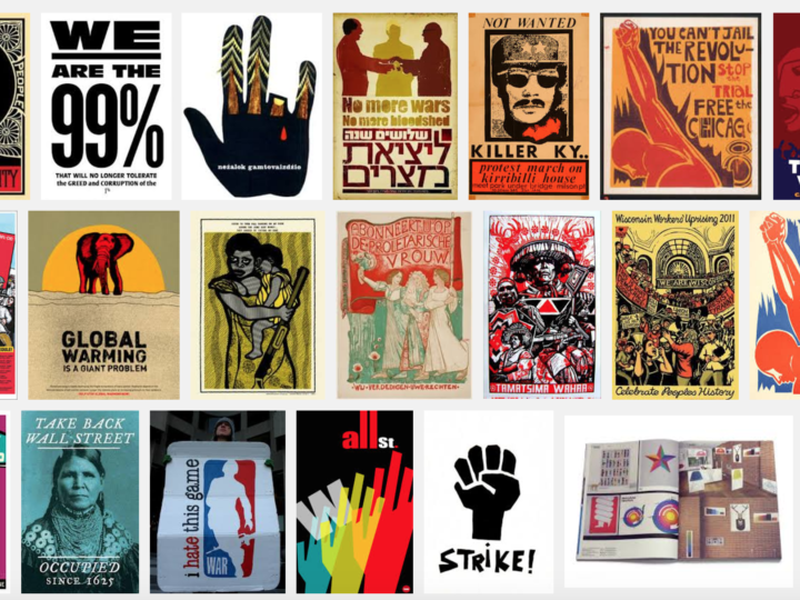
Today, I am trying to find a way forward, in part by looking back at the long history of protest graphics. Guity Novin’s online textbook A History of Graphic Design includes a chapter on protest graphics. From the Vietnam war through Occupy Wall Street and the Arab Spring, the chapter includes a wealth of inspiration for the future.

So if you, like me, are mourning the results of the Election, take heart! Throughout history the arts community has led the charge against hatred and bigotry. Together, WE SHALL OVERCOME!!


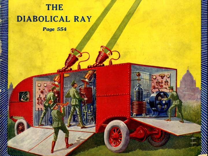
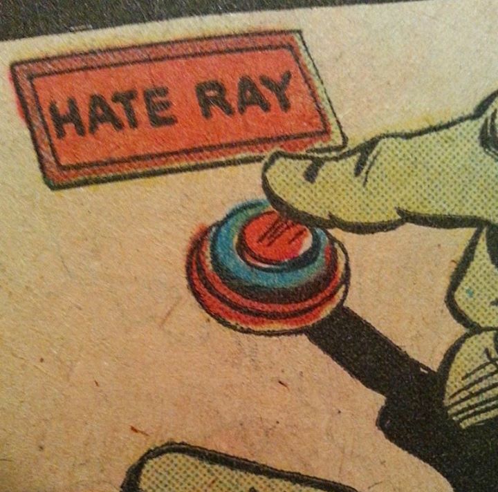
Yesterday in The Daily Heller, Steven Heller asked (facetiously one hopes!) Why shouldn’t electronics enable the manufacturing of “the diabolical ray”? I have to say with current events that doesn’t sound as unlikely as it would have 6 months ago! Entertaining though the 1924 illustrations are, I find it all too easy to imagine our current President chuckling evilly with his finger poised over the cartoonish ‘hate ray’ button. Blasting things out of the sky for no reason seems like it would perfectly suit his juvenile mentality. So hopefully, this one will stay in the realm of science fiction!


Full disclosure… I’m a Cubs fan. And not one of those Johnny-come-lately, oh look the Cubs are great now fans. I’ve been a fan for 25 years, and still I’m a lightweight compared to many! But I may be biased.

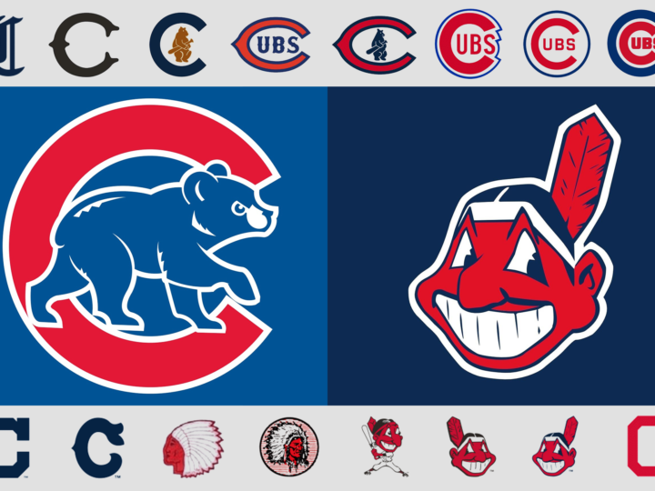
By any objective standard, if the World Series was based on the team’s logo, the Cubs wouldn’t be hoping to break a 108-year-long World Series drought by defeating the Cleveland Indians this year! Even if the Cubs didn’t have one of the best, most classic logos in all of the major leagues, the Indians are saddled with one of the worst.

Chief Wahoo came into existence in 1932 when the Cleveland Plain Dealer featured a caricature of a Native American with shaded skin and a pointy nose drawn by Fred George Reinert. And now, 84 years later, this racist caricature of a Native American remains the logo of the Cleveland Indians despite a campaign by some to get the baseball franchise to finally do away with the controversial emblem.

In stark contrast is the Chicago Cubs logo… easily one of best. It has been a continual evolution that started with the 1919 version of the logo. There are 6 different versions of the current classic logo of a “C” with “UBS” inside the “C.” The giant “C” has become rounder inside the blue circle and more geometric while the outlines are thicker. The first appearance of the bear was in the 1908 logo, which was also the last time the Cubs won the World Series. Now streamlined and stylized, the bear cub is ready to take on Chief Wahoo and the rest of the Indians in the 2016 World Series! Go Cubs, go!


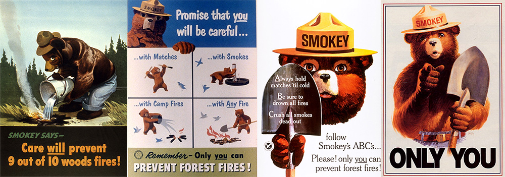
We all know the story of Smokey Bear, the little orphan cub who was rescued by firefighters after barely surviving a terrible forest fire. Since 1944, the Smokey Bear Wildfire Prevention campaign has been the longest-running public service advertising campaign in U.S. history. Smokey’s face and catchphrase “Remember… Only YOU Can Prevent Forest Fires” have become the iconic image for wildfire prevention in the U.S.Smokey-4

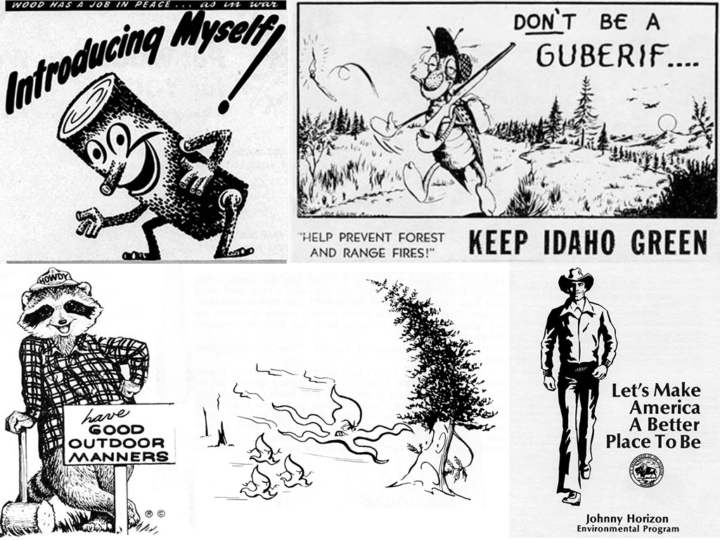
But how many people are aware of the pre-Smokey fire prevention characters? In this Atlas Obscura column, Smokey the Bear Has Nothing on These Forgotten Forest Mascots, Cara Giaimo introduces us to a wacky assortment of “spokesflora and fauna”…

  1. Woody the Log – who better to advocate for fire prevention than “a smiling, animated log”?
  2. The Guberif – firebug spelled backwards is a deadbeat, smoking insect with delusions of harmlessness!
  3. Howdy the Good Outdoor Manners Raccoon – urging children everywhere to “feed birds, protect flowers, and stop fishing in their neighbors’ streams without permission.”
  4. Johnny Horizon – environmental Marlboro Man and variety show performer.
  5. Sam Sprucetree – anti-fire and pro-logging environmentalists don’t grow on trees!
  6. Spunky Squirrel – Not your average squirrel, this one is a cool, hip-hop, fire thumping force of nature!

From 1944 through the mid ’80s, these alternate mascots battled with Smokey for supremacy over the forest fire prevention message. In the end though, Smokey smoked them all. And really, who among us is surprised? A mascot based on a cute little abandoned cub, singed but not broken, living out his life in the public view at the National Zoo? The others never had a chance.


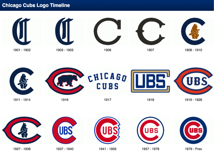
With the beginning of the 2016 baseball season, I thought I’d take a look at my favorite team logo, which coincidentally belongs to my favorite team… The Chicago Cubs. As one of the most storied teams in MLB history, it is only fitting that the evolution of their logo should be equally fascinating.

The Chicago Cubs began life in 1870 when they were known as the Chicago White Stockings, they spent one season as a traveling pro team before joining the National Association in 1871. After several different official and unofficial nicknames, and a switch to the brand new National League in 1876 the team started to be referred to as ‘the Cubs’ by local media beginning in 1902. By 1906 this was the sole name by which the club was known.

With the exception of two seasons in the early 20th century, the franchise has used blue in one way or another on their uniforms since 1901 when they were still known as the Chicago Orphans. A prominent part of every team logo has been a large C and for the better part of the past 100 years has used a variant of a large ‘C’ with ‘UBS’ written inside of it. This style made its first appearance in 1918 and subsequently evolved several times in the following decades with changes happening in 1919, 1937, 1941, 1957, and 1979.