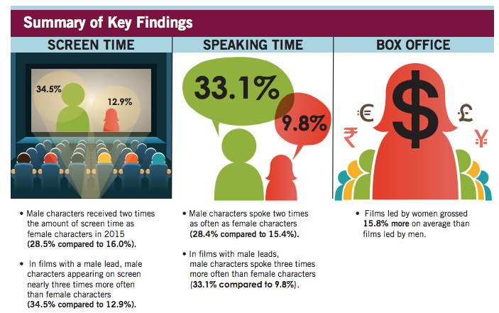
For the past 5 years, I’ve been working from home on corporate contracts providing UI/UX Design for online platforms. And I love it. In fact, I’ve spent most of this year changing the focus of my career away from Entertainment and toward what I imagined to be more meaningful projects in the Non-Profit Arts, News, Technology and Science industries.

As my Simmons contract of over 2 years was coming to an end I was trying not to panic. I was busy contacting people and applying for jobs, and doing all the things you’re supposed to do when looking for work. Then, out of the blue I got a text from a friend and co-worker… Her client at Apple TV+ was looking for a Production Artist/Designer to support the Creative Team in charge of all Apple’s new streaming service shows and would I be interested? I responded instantly, surprising even myself, hell yes I’d be interested!

My Simmons contract ended August 31 and on September 16 I was working a full time contract at Apple. Many people might think I took a step back in career terms. After all I was moving away from Entertainment, not towards it. And I loved working from home but now I’d be in an office 40+ hours every week.

The true irony of the situation is that I LOVE it! Yes I loved working from home, but I never realized how much I enjoy working in a hectic, frenzied creative environment on something as huge as Apple’s new streaming service. I feel completely revitalized and connected to current culture. And it’s Apple! I live my life on Apple products so this is just such a great fit for me.

This experience also reminded me that’s it’s not what you know but who you know that makes the biggest difference in looking for work. Thinking back, with maybe 2 exceptions, every job I’ve had in my 30+ year career came from either knowing somebody or being referred by somebody. And yes, there’s also an element of luck involved. I am truly grateful for the opportunities I’ve had to make my contribution to the world of entertainment. And I’m happy to discover that I still have more to contribute!


When I was studying Design in college there were no computers. We relied on t-squares, drafting boards, rubber cement and x-acto knives to bring our designs to life. We drew our own icons and letters using Rapidograph pens. I spent an entire semester arranging a dozen black squares of different sizes in a big white square to learn the visual dynamics of shape.

After I graduated and got my first job at The Village Voice, the paper was still produced using galley text and paste-up. At first there was a guy who set the headlines one letter at a time using an optical printer! By the time I moved to Los Angeles, we had advanced to setting our own headlines on CRT monitors using string commands.

My first jobs working in Entertainment Design featured color copiers, stat cameras and air brushing. My first experience with WYSIWYG computers was a MacPlus that we set type on. Photoshop was a glorious  invention, but it didn’t have layers at first so if you pasted a head onto another body, there was no going back.

Flash forward to now and I can’t imagine designing without Adobe Creative Suite, HTML/CSS and the hundreds of other hardware and software tools available. Times change and technology advances and we have to advance with it. In fact I love Photoshop like it’s a member of my family. But, my most important tool, the one I use the most, every day on every project, is my brain.

Saul Bass once said, “Design is thinking made visual.” I love that statement as it sums everything up so elegantly. Leave it to the master. For me, design without thought is mere decoration. I select from my whole arsenal of tools for every project, but first and foremost, I engage my brain every time.


There’s a saying in the creative industry that you have to pay your dues before you can pay your bills. Well I’ve paid my dues, and I’ve been fortunate enough to pay my bills. Now I find myself looking around and wondering what’s next for me. With over 30 years in Art Direction and Design, I’ve earned a significant amount of creative capital, and I want to spend it in a way that matters.

It seems my career has come full circle since what originally attracted me to Graphic Design was the idea of visually communicating useful information to a wider audience. As I look toward my next project, I’m thinking about things that are important to me; art, music, education, social justice, diversity, health & wellness, the environment, scientific advances… And I’m trying to figure out how best to contribute my talents. The good news is that design is design. It doesn’t matter if it’s corporate, entertainment, publishing, digital or print. With design, the message is the medium. That’s why I love it.

So I’m officially launching my own exploratory committee to see how I can combine making a living with making life better for everyone. I welcome any positive ideas and feedback from my friends in the creative community.


Back in 2016, I created a Facebook Group called Working Artists Collective for my creative friends to share tips, advise and leads for making progress in our respective careers. Since then it has grown to over 200 members and is often the site of lively discussions about all sorts of art-related issues. As I am increasingly time-challenged, I tend to post there far more frequently than I do here. So I thought I’d invite anyone interested enough to be looking at my blog to come join us on Facebook!


On September 9, 2017, hundreds of former Village Voice employees converged on New York City to celebrate our shared experiences at one of America’s most iconic alternative newspapers.

I was lucky enough to be the very first Art Department intern (under Art Director George Delmerico) atThe Voice in 1984, while in my senior year at S.U.N.Y. Purchase. It was long before desktop publishing so we designed our layouts the old-school way; with blue-line grid paper, pencils and rulers. Every Monday night (The Voice went to press on Tuesday morning), a guy whose name escapes me set each headline, one letter at a time, using a photographic typesetter!

After college, I was hired by the new Design Director, Michael Grossman, as an Associate Art Director. This was my first job right out of college, and I owe my entire career to it. Working at The Voice was so much more than just a job though. For me, it was family, mentors, best friends, hated frenemies… It was graduate school. It was where I developed the artistic, political, social and moral viewpoints that I hold to this day. I grew up there and in my opinion there was no better place on earth to do it.

On September 20, 2017, the final print issue of The Village Voice hit the streets. I had a friend get me a copy and mail it to me. I know to most it’s just ink and newsprint, but to me it’s like a family photo album, filled with amazing stories, incredible memories, and the coolest people in the world.The Village Voice print edition is no more. I will miss it. But I hope to see the people again before long!

Village Voice Art Department c. 1986 (Photo by Catherine McGann)

Top photo: Village Voice Art Directors in NYC on September 9, 2017 (Photo by Celeste Melisande Sloman)


Unlike some food, design can be good for you and still be appealing and tasty. Take The Street Store, for instance. I was recently introduced to this ‘franchise’ of pop-up stores for the homeless through a friend’s Facebook post. I was duly impressed by their charitable mission, but it was their elegant, smart and utilitarian design that really wowed me. The use of simple, bold graphics on cardboard is both understated and powerful at the same time. It is helpful, and enticing without being overbearing or preachy. Images of all kinds of needy people weeping for joy as they find the perfect fit in a pair of shoes reinforce the message that this is about helping people.

Anyone interested in hosting a Street Store event can apply through their website thestreetstore.org and follow seven simple steps to change the life of the needy for the better. Included are five posters with instructions on how to use them:
The-Street-Store-Posters

My personal favorite is the poster which functions as a hanger for clothes, but all have the same simplicity and powerful impact.


“Tonight we cry. Tomorrow we fight!”

That was my final tweet before calling it quits on the worst Election night of my life. I thought nothing could top the 2000 Election which dragged on for weeks before George W. Bush was declared the winner by a margin of 537 votes in Florida. But Drumpf’s victory Tuesday night wasn’t just about political differences. That I could handle. Drumpf’s victory represents a personal violation of everything I hold most dear: freedom, justice and equality for all; a woman’s right to self-determination; compassion and aid for the most vulnerable among us; a celebration of diversity; the pursuit of peace; and, perhaps most importantly, a commitment to preserve the earth for all living things.

So what now?

In the immediate aftermath, CNN commentator Van Jones said “This was many things. I — this was a rebellion against the elites, true. It was a complete reinvention of politics and polls. It’s true. But it was also something else. We’ve talked about race –we’ve talked about everything but race tonight. … This was a whitelash. This was a whitelash against a changing country. It was a whitelash against a black president, in part. And that’s the part where the pain comes. And Donald Drumpf has a responsibility tonight to come out and reassure people that he is going to be the president of all the people who he insulted and offended and brushed aside. Yeah, when you say you want to take your country back, you’ve got a lot of people who feel that we’re not represented well either, but we don’t want to feel that someone has been elected by throwing away some of us to appeal more deeply to others. So, we — this is a deeply painful moment tonight. I know it’s not just about race. There’s more going on than that, but race is here too. We’ve got to talk about it.”

Representative John Lewis said “We cannot be complacent, but we cannot be vengeful. We must speak truth to power and fiercely defend those who are the most vulnerable.”

Senator Elizabeth Warren said “We will stand up to bigotry. No compromises ever on this one. Bigotry in all its forms. We will fight back against attacks on Latinos, on African Americans, on women’s, on Muslims, on immigrants, on disabled Americans, on anyone.”

Today, I am trying to find a way forward, in part by looking back at the long history of protest graphics. Guity Novin’s online textbook A History of Graphic Design includes a chapter on protest graphics. From the Vietnam war through Occupy Wall Street and the Arab Spring, the chapter includes a wealth of inspiration for the future.

So if you, like me, are mourning the results of the Election, take heart! Throughout history the arts community has led the charge against hatred and bigotry. Together, WE SHALL OVERCOME!!


When I heard of His Purple Majesty’s untimely passing yesterday, I not only mourned the loss of a talented musician (who provided a big part of the soundtrack to my college years), I mourned the loss of a uniquely gifted visual artist as well. Prince’s canvass was his body, his lifestyle, his music, and his attitude. There will probably never be another artist who can match his masterful blending of textures, colors, symbols, images, genders, genres, words and music into something so flamboyantly well… Prince.

Perhaps the best example of this is Prince’s adoption in 1993 of The Love Symbol, an unpronounceable mark, as the only proper visual moniker for The Artist Formerly Known as Prince.

He stated in a press release at the time:

Warner Bros took the name [Prince], trademarked it, and used it as the main marketing tool to promote all of the music I wrote. The company owns the name Prince and all related music marketed under Prince. I became merely a pawn used to produce more money for Warner Bros…. I was born Prince, and did not want to adopt another conventional name. The only acceptable replacement for my name, and my identity, was a symbol with no pronunciation, that is a representation of me, and what my music is about. This symbol is present in my work over the years; it is a concept that has evolved from my frustration; it is who I am. It is my name.

In order to use the symbol in print media, Warner Bros. had to organize a mass mailing of floppy disks with a custom font. Yes they had to make a custom font just for Prince!

For an in-depth look at the evolution of Prince’s brilliant self-branding, check out this article in Fader:
The Higher Meaning Behind Prince’s Love Symbol


I spend so much time thinking about attracting people to the things I design that I was taken aback by the concept of ‘hostile design’ when I first heard about it. Call me a zany optimist, but I always thought of public parks as pleasant places and bus benches as making modern life more convenient. Now I find out people actually design things in public spaces to DISCOURAGE the public from using them for too long or too comfortably.

In this 99% Invisible episodeGordan Savičić and Selena Savić, co-editors of the book Unpleasant Design, point out the use of everything from sounds and lights (my favorite being housing estates in the UK that put up pink lighting, aimed to highlight teenage blemishes), to more overt physical measure such as metal spikes on benches, to keep the undesirables away. The problem with this approach is that it addresses the symptoms of the problem (like homeless people sleeping on bus benches) rather than the deeper causes of the problem. Unpleasant designs for public spaces are essentially shuffling people off to bother somebody else.

The other problem with hostile design is that metal spikes can’t make a judgement call when somebody needs help. According to 99% Invisible: “The reason we need a critical theory of unpleasant design is so we can recognize the coercion that is taking place in our public spaces. We need to know when we are replacing human interaction, nuance and empathy with hard, physical and non-negotiable solutions.”

For my part, I think we have enough hostility in our public environment already. What we need is a welcoming, inclusive public architecture, not a bench that gives us the brush off!


How do you quantify a deficiency that approximately half of the audience is blind to? That’s the question that led Geena Davis, Academy Award Winning Actress and Founder of the Geena Davis Institute on Gender in Media, to become a data head. According to this interview on KPCC’s Take Two, Davis was inspired by the lack of strong female role models for her young daughter, to find a way to hold Hollywood’s feet to the fire when it comes to gender equality in entertainment.

Together with Shri Narayanan, of USC’s Viterbi school of engineering and technical research lead and Julie Ann Crommett, Google’s Entertainment industry educator in chief, the Institute recently unveiled their new software at the Global Symposium on Gender in Media. It’s called GD-IQ, short for Geena Davis Inclusion Quotient, and it measures things like screen time and speaking lines for various characters.

Shri Narayanan explains how it works… “For example just take the visuals, so shot by shot this computer algorithm goes through it and figures out, where are the faces? Once that’s done, it tracks them through the scenes and then automatically another algorithm figures out what is their gender and then you can run through the data in real time…and so by the end of that you have specific numbers and in a quick way have how much screen time a person has and how it’s distributed across various genders.”

The software then produces a score, indicating the level of gender diversity for the program or film. Viewers and advertisers can judge whether or not they want to associate themselves or their products with the show based on that score.

Given that we may soon have our first woman President, and not just on a TV show, I think this is well-timed indeed!